Introduction
A bold identity for a media platform connecting female influencers with brands through curated promotional partnerships.
Client
Oh Ok!
Services
Branding
Agency
Bkr
Year
2018
About the Project
Oh Ok! needed a visual system with enough polish for brand partnerships and enough attitude to live inside influencer culture.
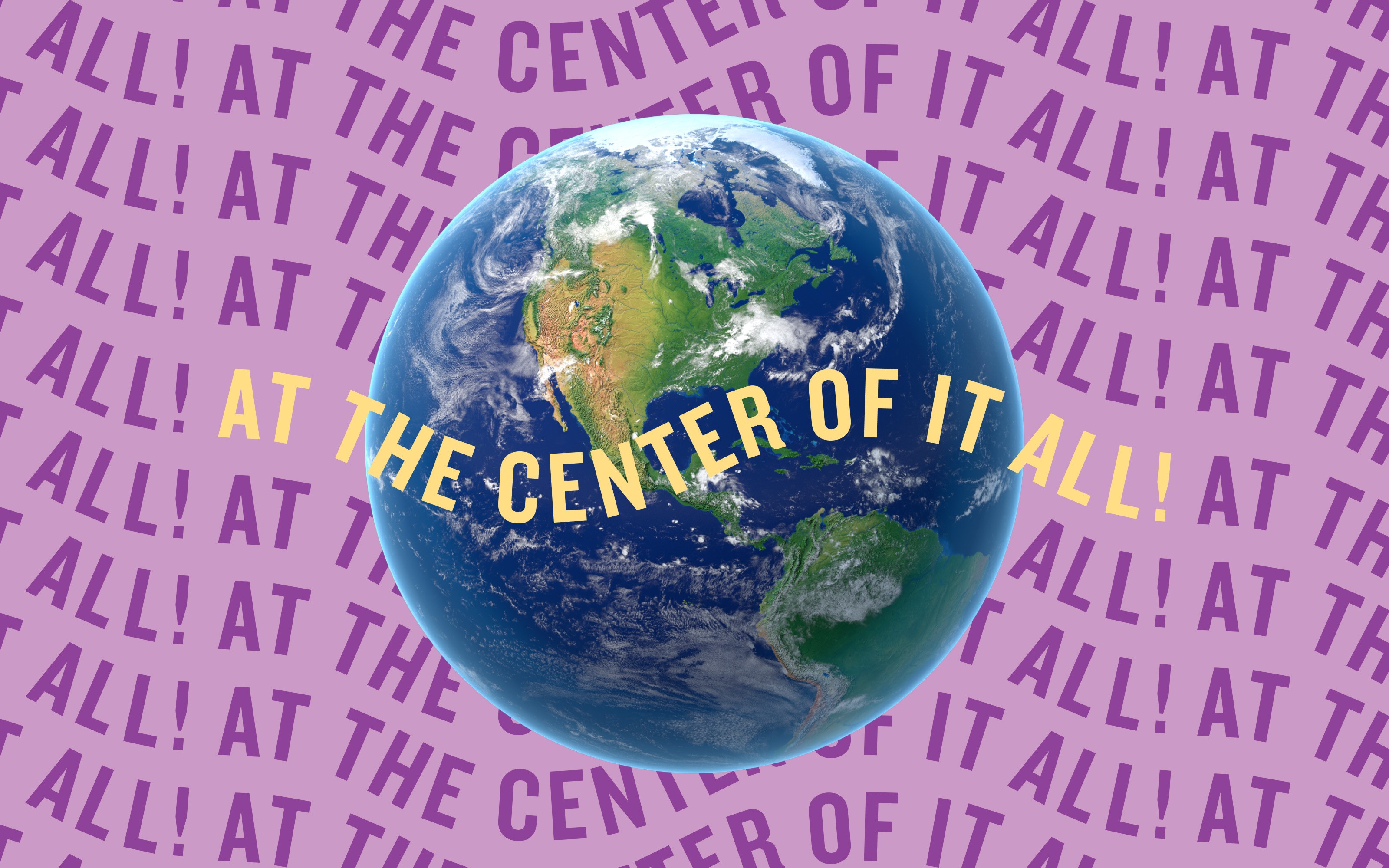
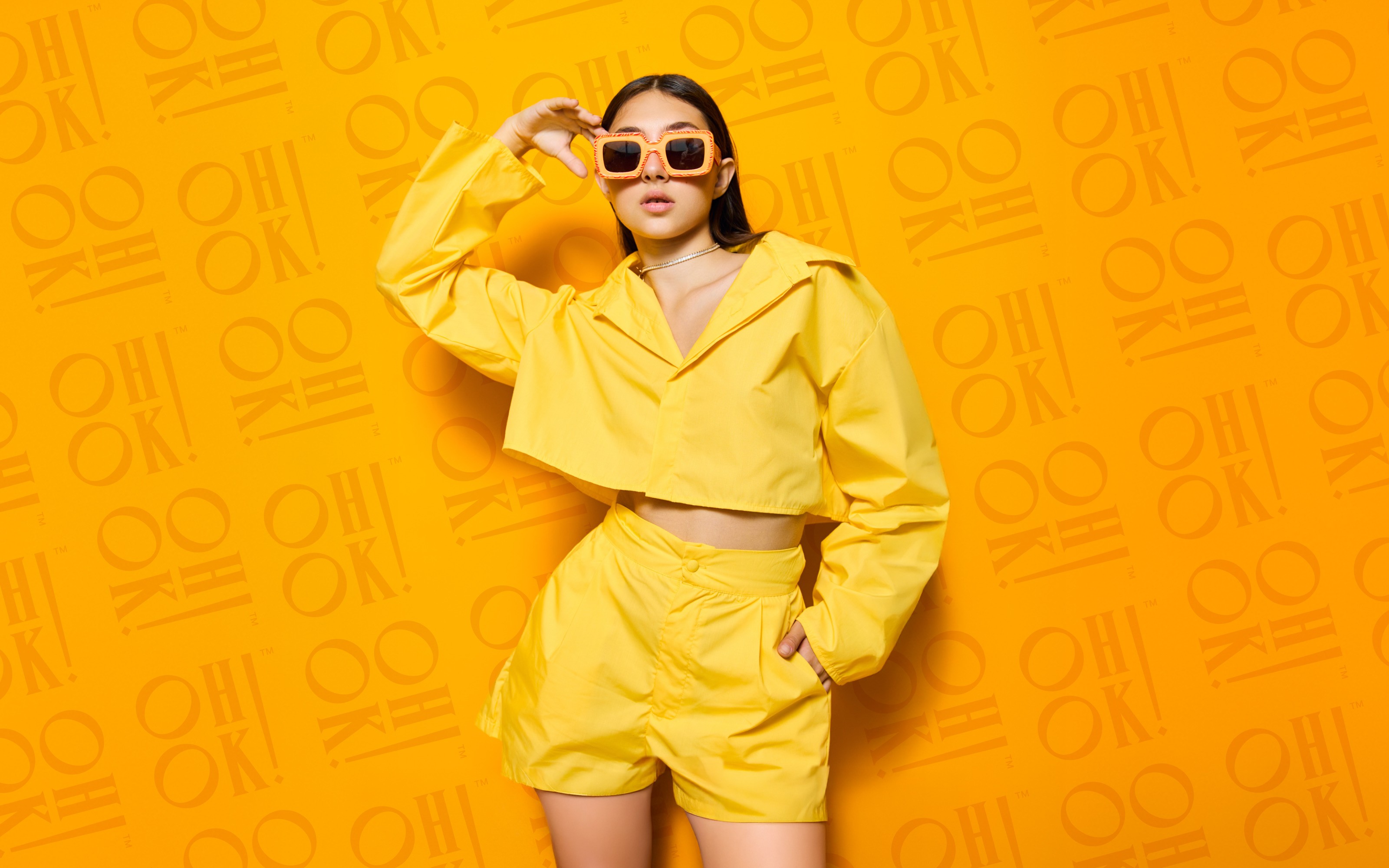
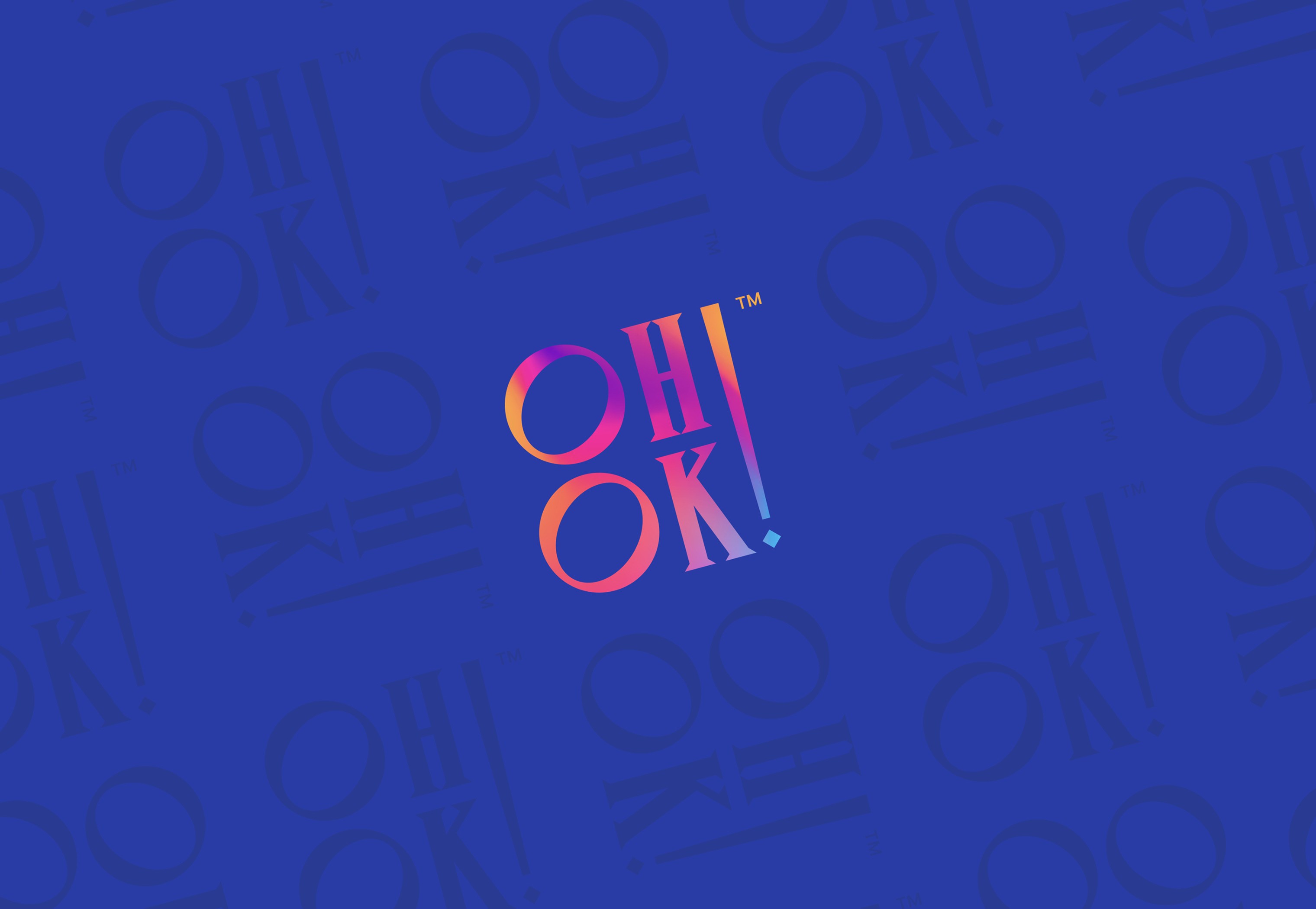
The identity was designed to feel energetic, expressive, and immediately recognizable. The logo uses bold, stacked typography and punctuation as a visual cue, giving the mark a sense of voice before a single line of copy is read. Saturated color, gradient treatments, and repeat patterns create a system that feels social-first and highly flexible. The work needed to speak to both sides of the platform: brands looking for credibility and influencers looking for opportunity, visibility, and cultural fluency.
The Approach
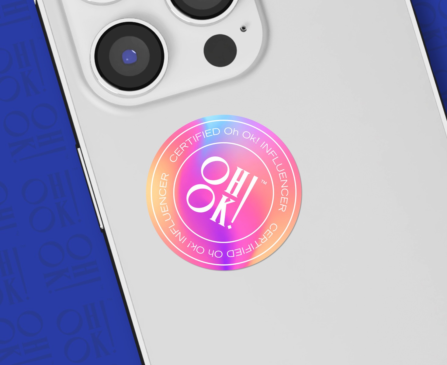
The direction leaned into contrast, color, and expressive typography. Each element was built to feel confident and current while remaining structured enough to support campaigns, creator materials, and brand-facing communications.
Final Thoughts
Built to move between culture and commerce without losing its voice or visual energy.
Oh Ok! understands the space it occupies. It's not corporate, but it is credible. It's playful, but still intentional. Its tone feels direct and culturally aware, matching the speed of influencer marketing while giving the company a distinct presence. The result is a brand identity that feels built for connection, visibility, and momentum.