Introduction
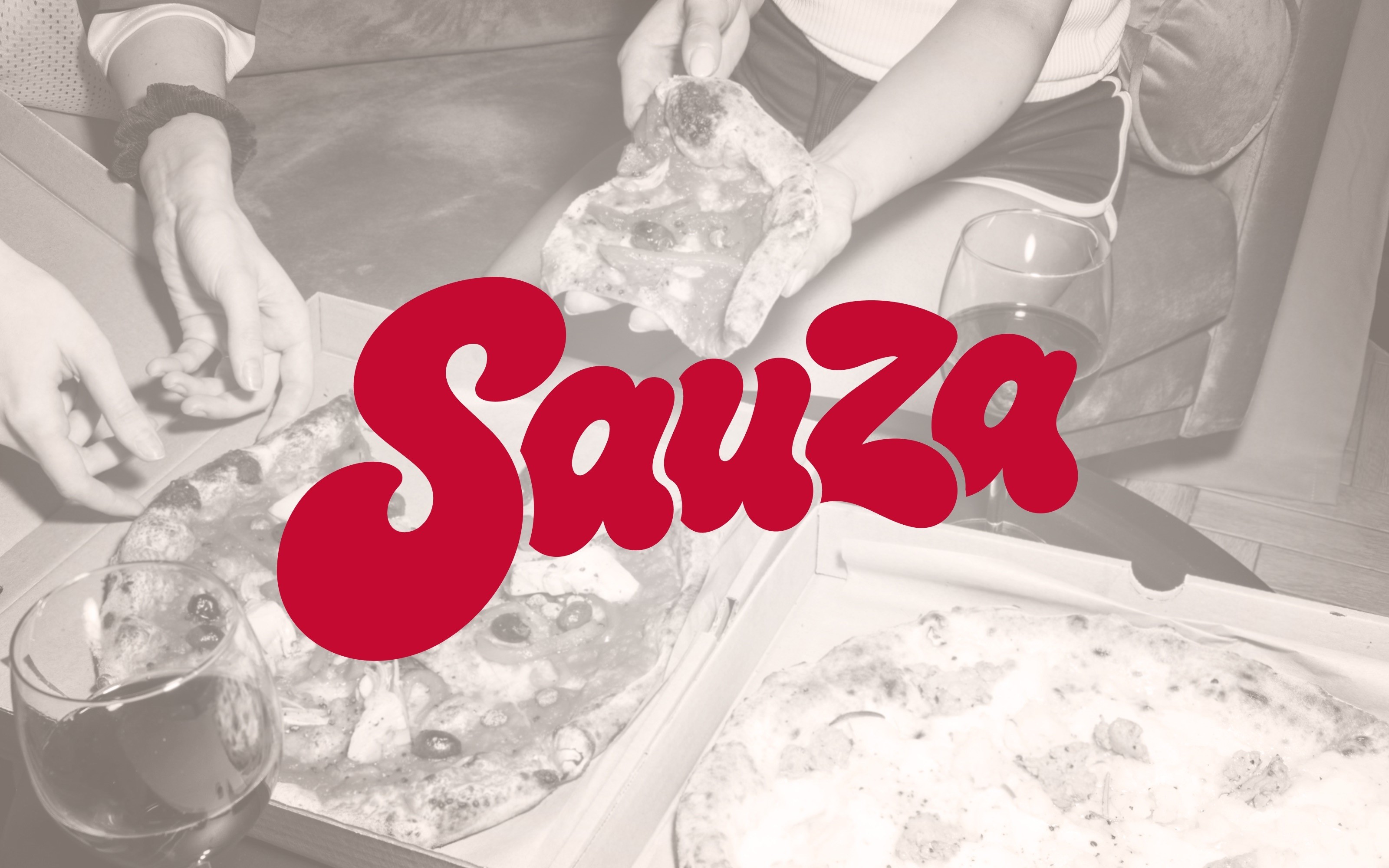
A playful NYC pizza brand built around bold type, flash photography, and late-night appetite.
Client
Sauza Pizzaria
Services
Branding
Agency
Bkr
Year
2020

About the Project
Sauza needed an identity that felt fast, loud, and familiar, capturing the energy of New York without relying on nostalgia alone.
The brand was designed to feel immediate and full of personality. The custom logotype carries the weight of a classic pizza shop mark, but with a softer, more playful rhythm that gives it its own voice. Color plays a central role, pairing deep red with warm gold to create a system that feels both appetizing and unmistakable. Across packaging, apparel, and signage, the identity creates a sense of recognition that feels casual, confident, and built for the street.
The Approach
The goal was to make Sauza feel less like a polished restaurant concept and more like a place people already knew.
Final Thoughts
A pizza brand built for the table, the sidewalk, the afterparty, and everything in between.
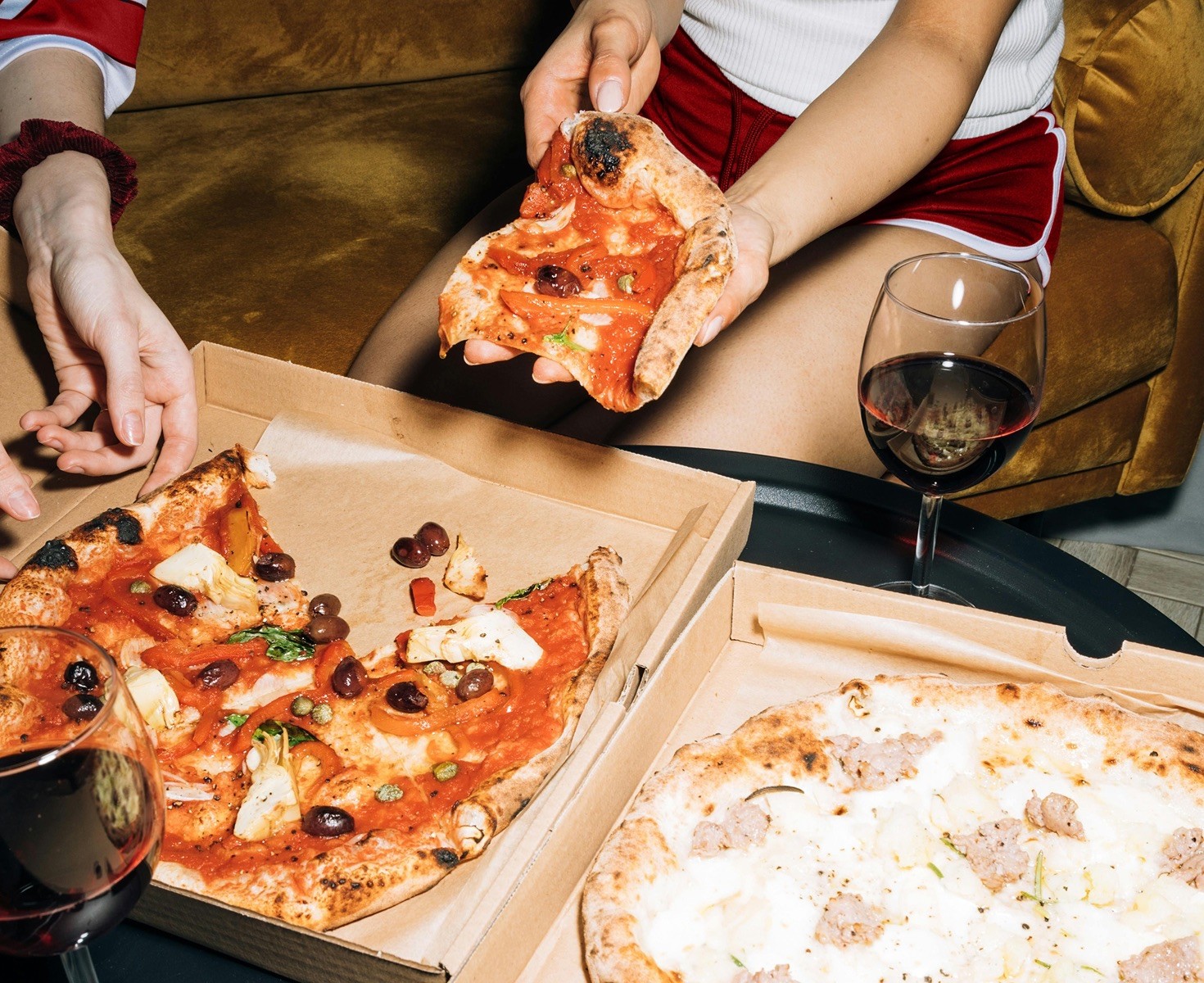
Sauza works because it does not try to overcomplicate the experience. The brand is direct, fun, and easy to remember, with a visual system that can move from a pizza box to a T-shirt without losing its character. The photography style gives the identity a social quality, capturing pizza as something shared with friends. Together, the work creates a brand that feels alive in the city and comfortable in its own attitude.