
SERVICES:
BRANDING
Role:
Creative Director / Designer
Velsaire
Break Point
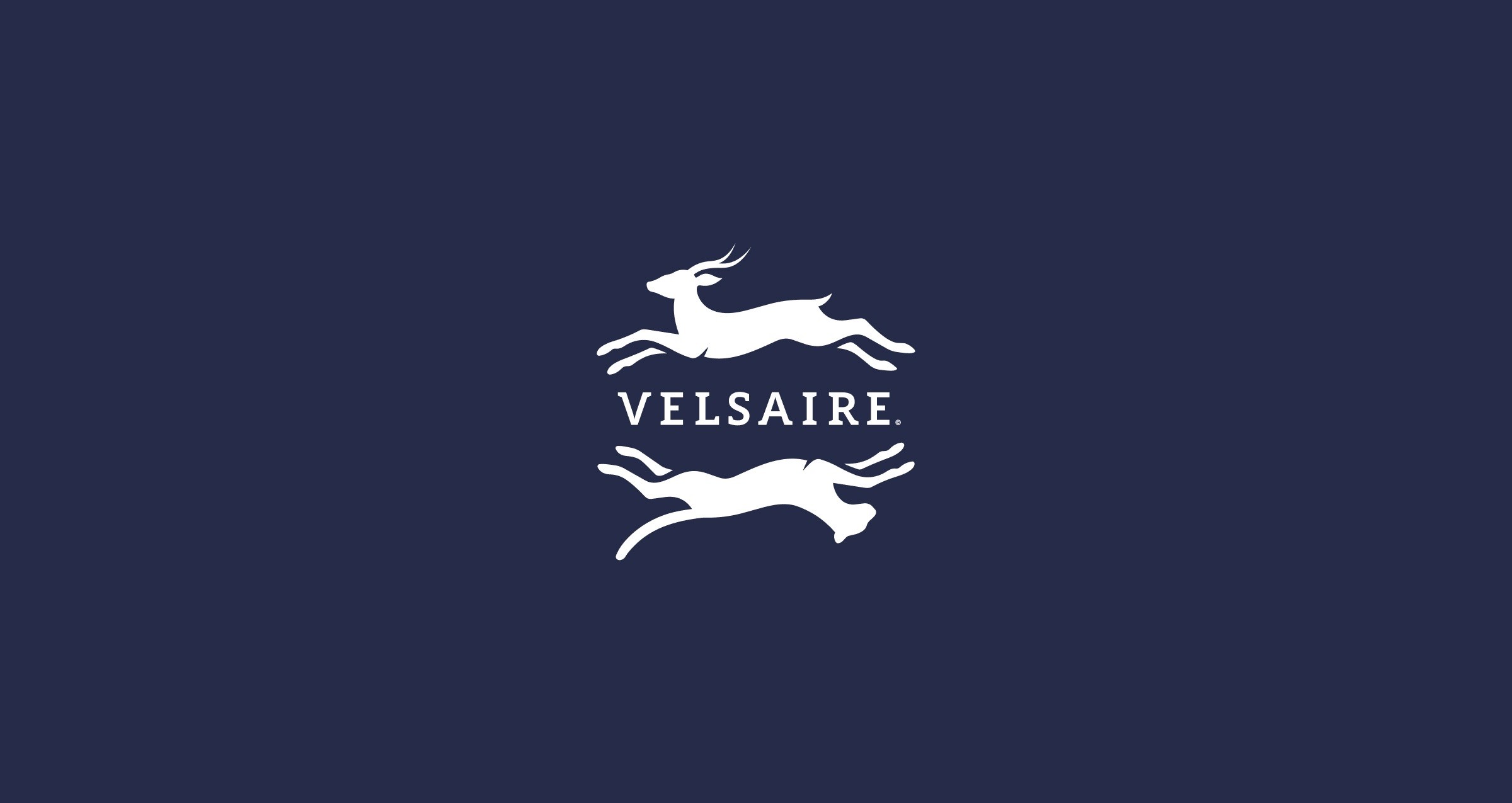
Velsaire asked for a brand that understood tennis as both sport and social setting. The identity needed to carry the tension of the game without losing the ease of the environment around it. The idea was to create something that felt sharp enough for competition and stylish enough to live in the culture surrounding the court.
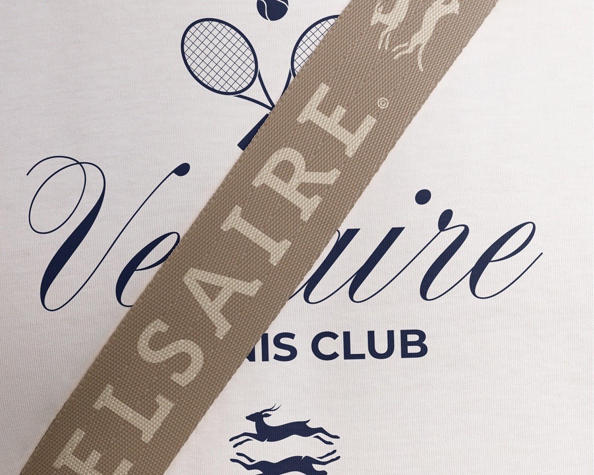
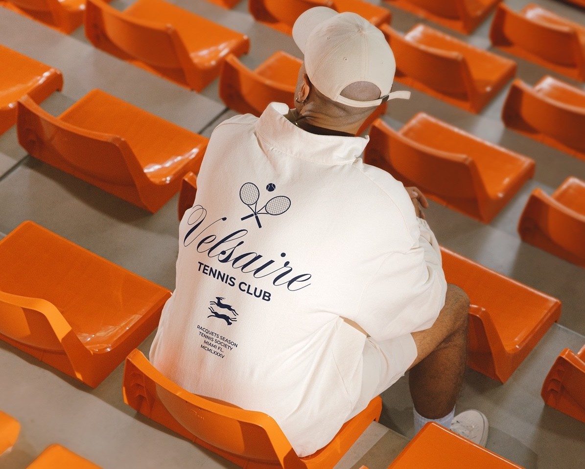
Approach

At the center of the project was a simple idea: every match can shift in energy quickly. One player begins to press, the other responds, and the game becomes a study in instinct. Velsaire was built around that tension, using the predator and prey motif to represent that dynamic.
The direction came from the psychology of the match, where patience can become pressure in an instant.




Design
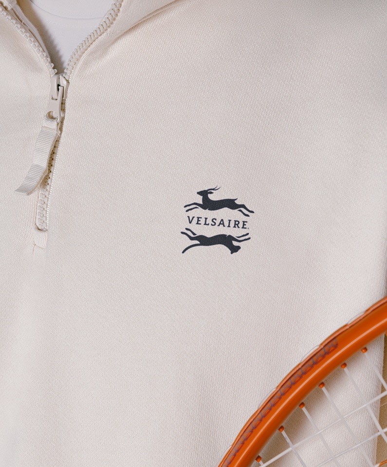
The logo captures the split second that defines competition: one side pursuing, the other reacting, both locked into the same moment. The mark gives Velsaire a sense of instinct without making the brand feel overly aggressive.
In the context of tennis, that relationship becomes a metaphor for pressure. The constant shift between attack and defense.