
SERVICES:
BRANDING
Role:
Creative Director / Designer
Harrington Field
The Value of Patience

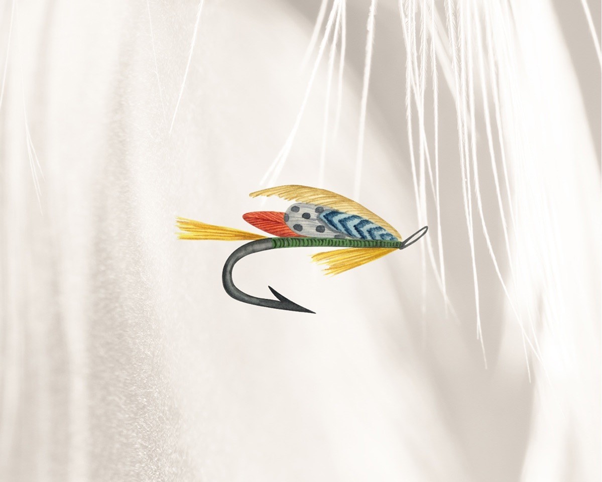
A brand built for a customer who sees fly fishing as more than a pastime. It is a practice shaped by an appreciation for the well-made. The challenge was to create an identity that felt elevated while still belonging naturally on the water.
Approach

The direction was drawn from the quiet details of the sport. Where motion, material, and restraint all carry meaning.
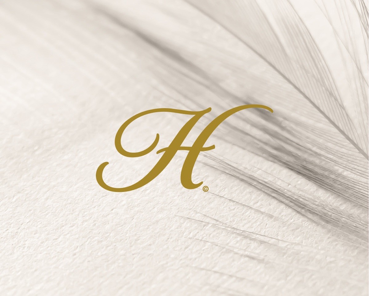
The wordmark was shaped around the feeling of preparation before the cast. Inspiration drawn from the curve of a fly line, the finish of a reel, and the stillness of the water. The result is a brand that feels considered, tactile, and deeply connected to the rhythm of fly fishing.

Design
The final identity gives Harrington a brand system that feels elevated, measured, and closely tied to the ritual of the sport.
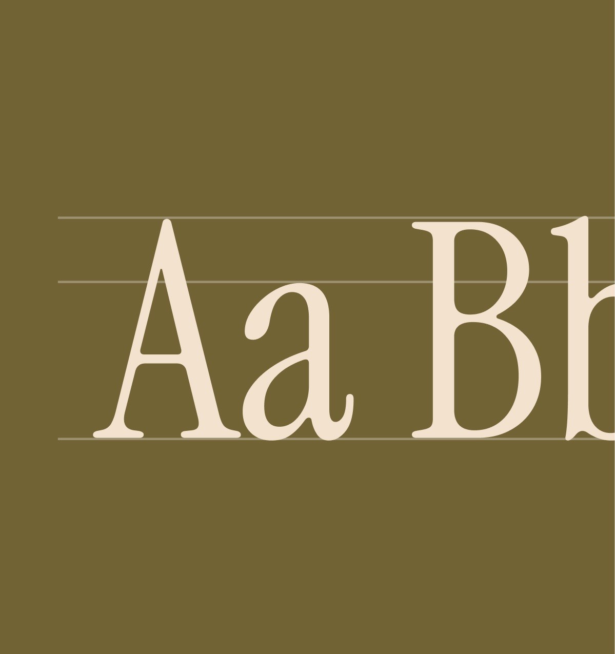
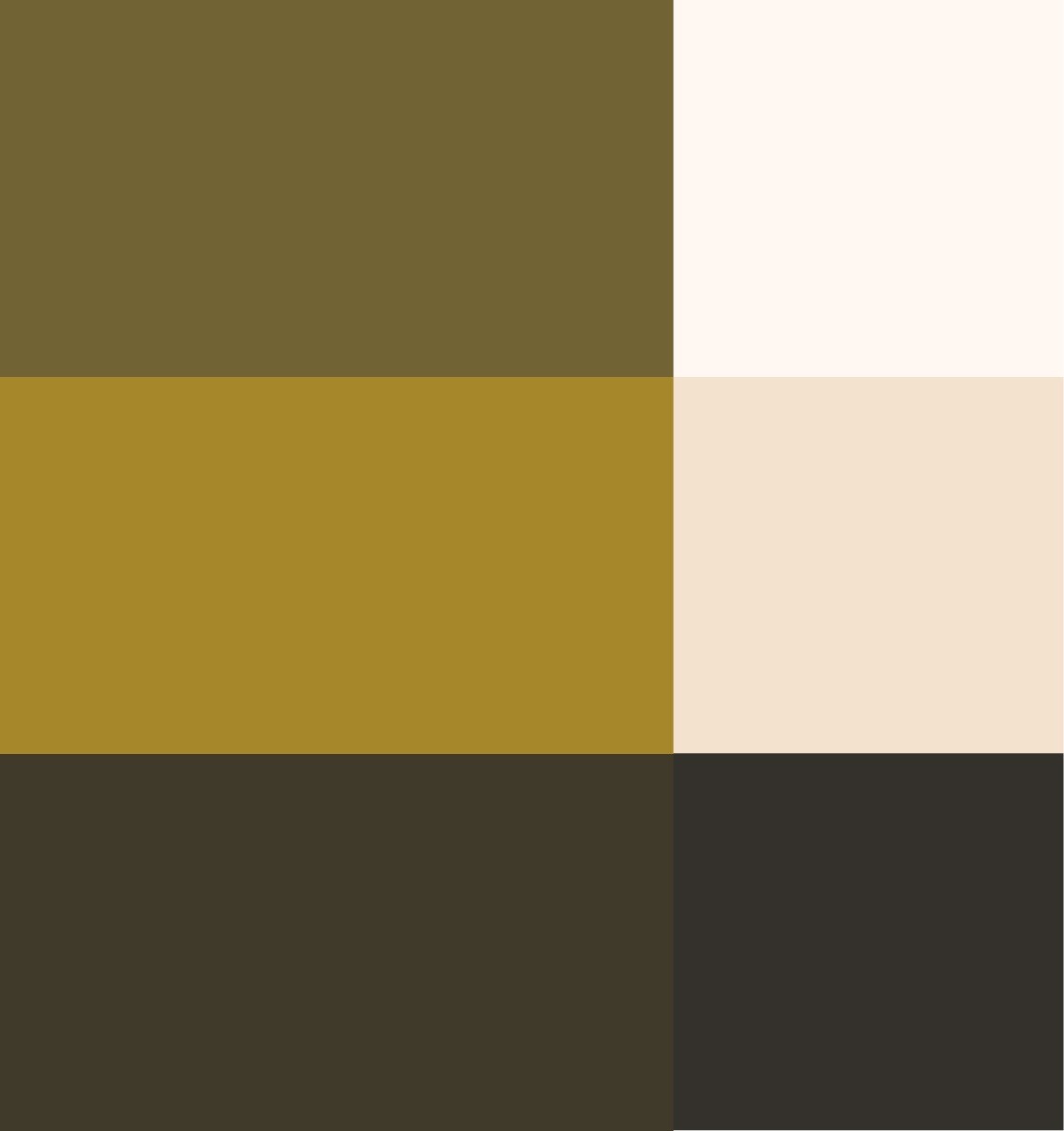
The design relies on restraint, allowing the materials and details to carry much of the character. A muted palette, elegant typography, and a careful use of space give the brand a sense of permanence without making it feel distant. Harrington feels at home in the field and on the shelf, with an identity that honors the craft of fly fishing while giving the brand a distinctly premium presence.