Introduction
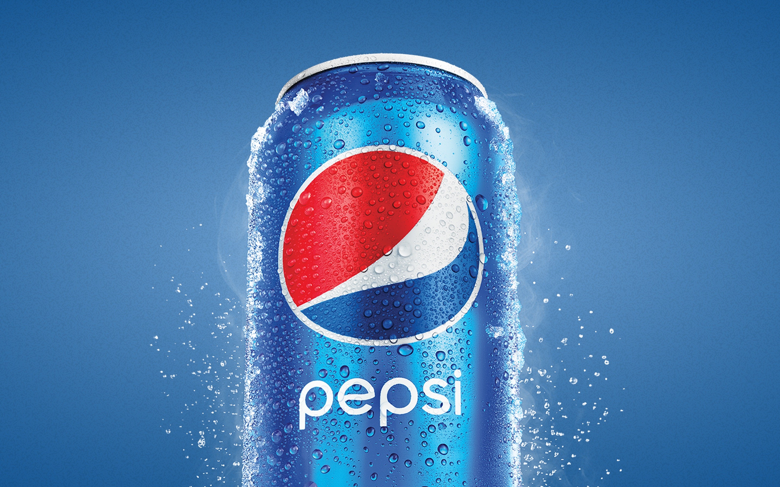
A website redesign bringing Buffalo Rock’s beverage portfolio, history, and Southern presence into one clear digital system.
Client
Buffalo Rock
Services
Web
Agency
Cayenne Creative
Year
2021
About the Project
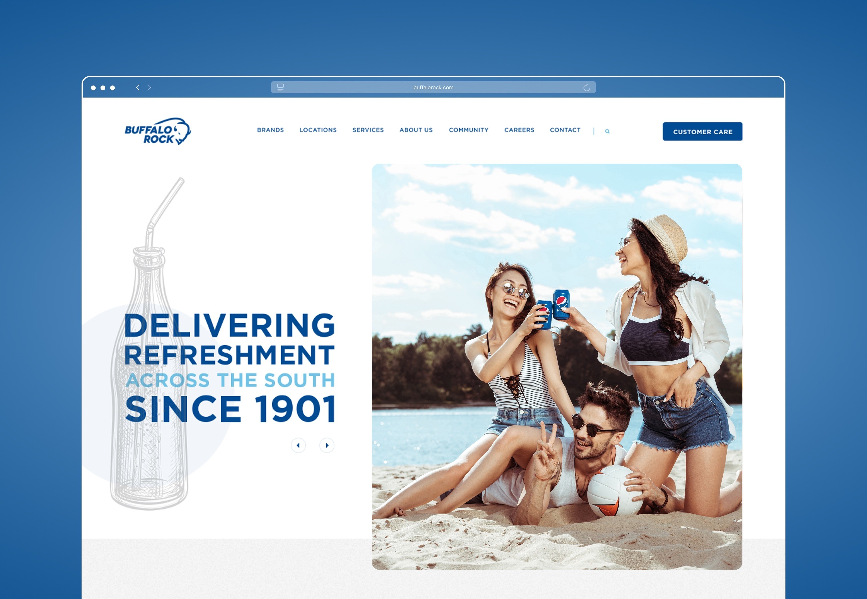
The site brings a large, regional bottling company into focus through structured navigation, product-forward design, and a refreshed visual language.
The Buffalo Rock website was designed to make a layered company feel easy to understand. Instead of treating the site as a directory, the experience gives the brand room to tell a clearer story about its products, people, and regional legacy. Product photography brings immediate recognition, while the refreshed layout creates a stronger sense of order and pace. The design keeps the experience approachable, allowing Buffalo Rock’s scale to feel organized without losing the familiarity of a company tied to the South.
The Approach
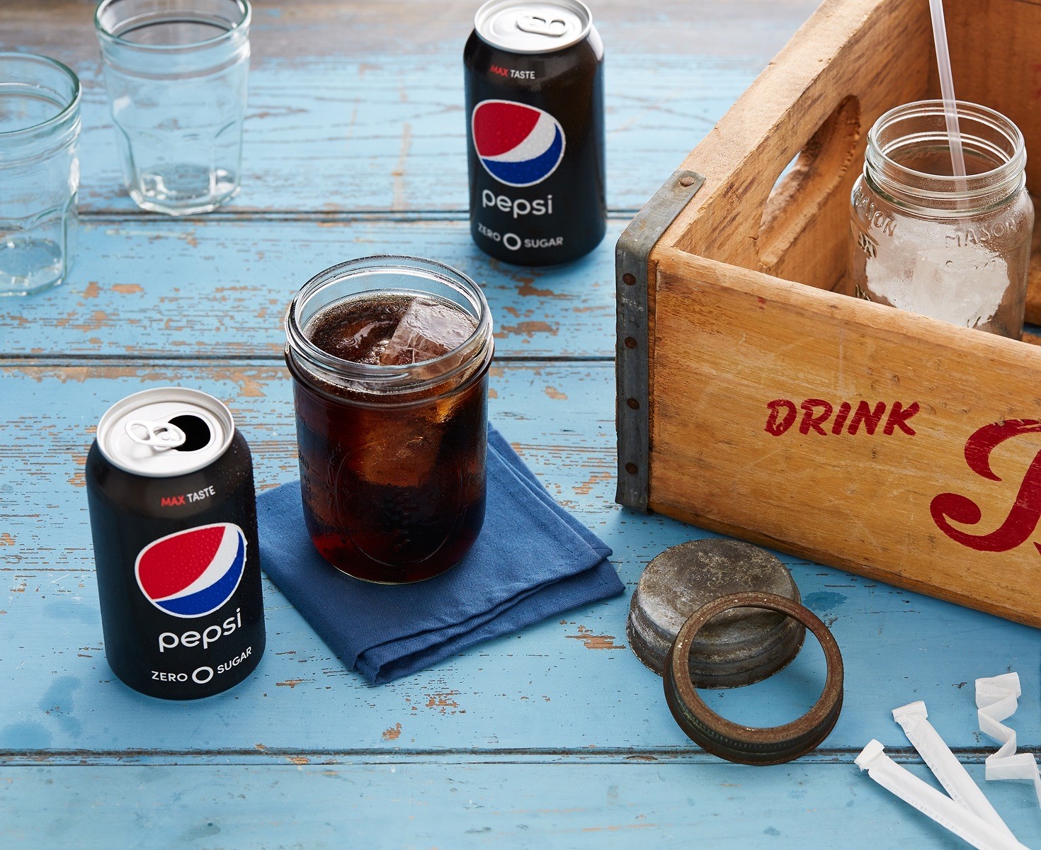
The direction focused on clarity, hierarchy, and product presence. Navigation was simplified, content was organized around user needs, and visual moments were built around appetite, recognition, and regional relevance.
Final Thoughts
A website built to make a legacy bottling company feel current and easy to explore.
More importantly, it presents Buffalo Rock as a company with history and momentum, one that continues to serve the South while adapting to how people discover and interact with brands today.