Introduction
An identity built around restraint, craft, and the quiet rituals of the outdoors.
Client
Harrington Field
Services
Branding
Agency
Bkr
Year
2019
About the Project
Harrington needed a visual system that felt refined, balancing technical credibility with a strong sense of outdoor tradition.
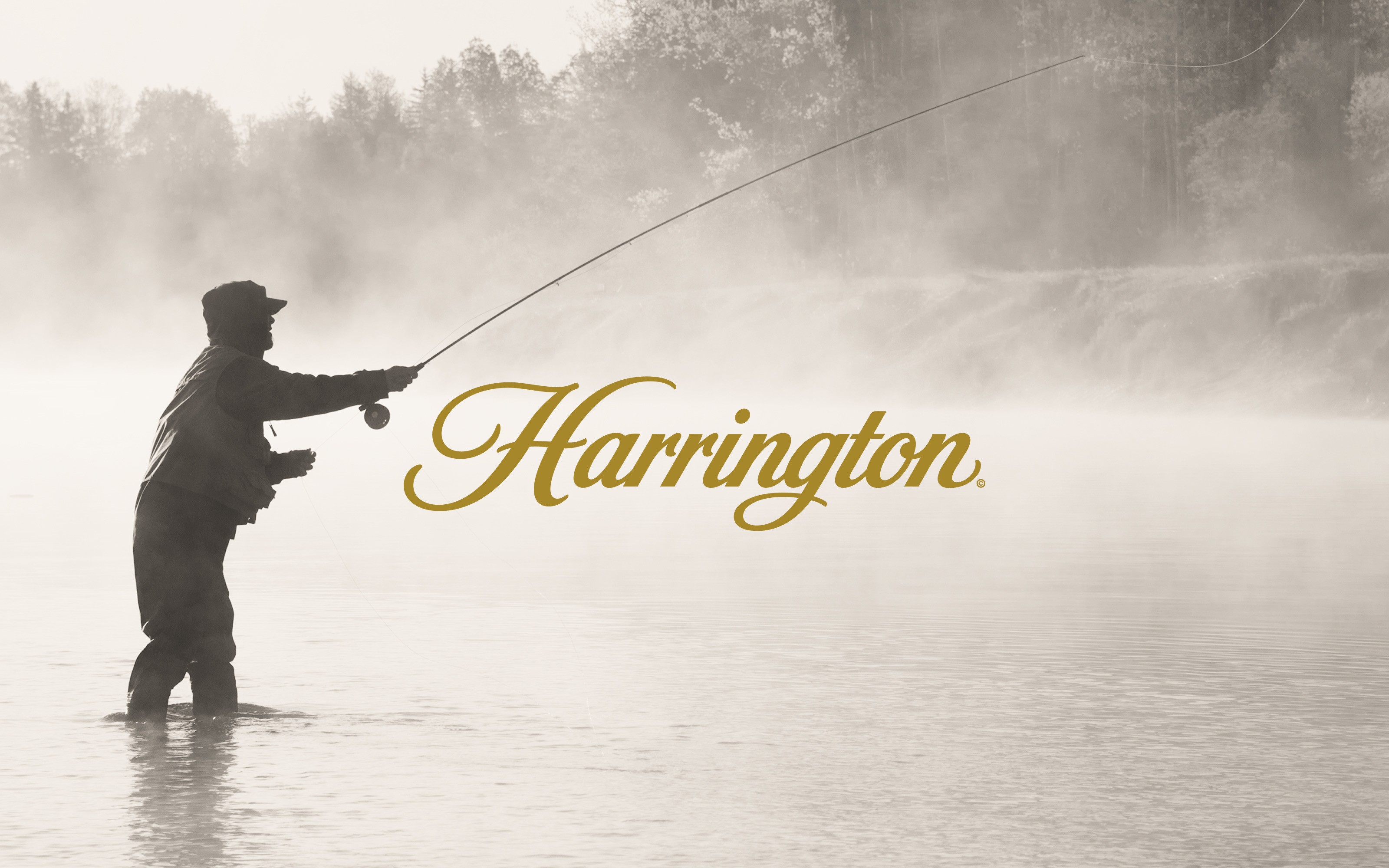
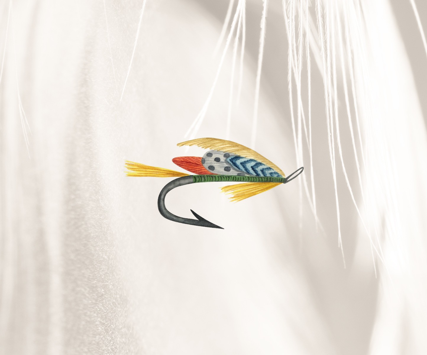
The brand identity was designed to feel established from the start. A refined script wordmark gives Harrington a sense of heritage, while the supporting visuals bring texture, atmosphere, and specificity to the system. Hand-rendered fly illustrations add a layer of craft, connecting the brand directly to the precision of the sport. The muted palette, soft photography, and generous use of space create a tone that feels premium without feeling distant. Every element supports a brand rooted in patience, skill, and material detail.
The Approach
The direction centered on quiet confidence. We wanted the mark and supporting visuals to feel considered, tactile, and closely connected to the rituals of fly fishing.
Final Thoughts
A brand shaped by the same patience and precision that define the sport itself.
Harrington works because it does not try to force an outdoor identity. It lets the details carry the story. The mark feels classic. The illustrations feel handmade. The photography feels still and observant, allowing the landscape and product to hold equal weight. Together, the system creates a brand that can live naturally across apparel, gear, packaging, and editorial moments. It feels less like a new company trying to enter the category and more like one that has always belonged there.