Introduction
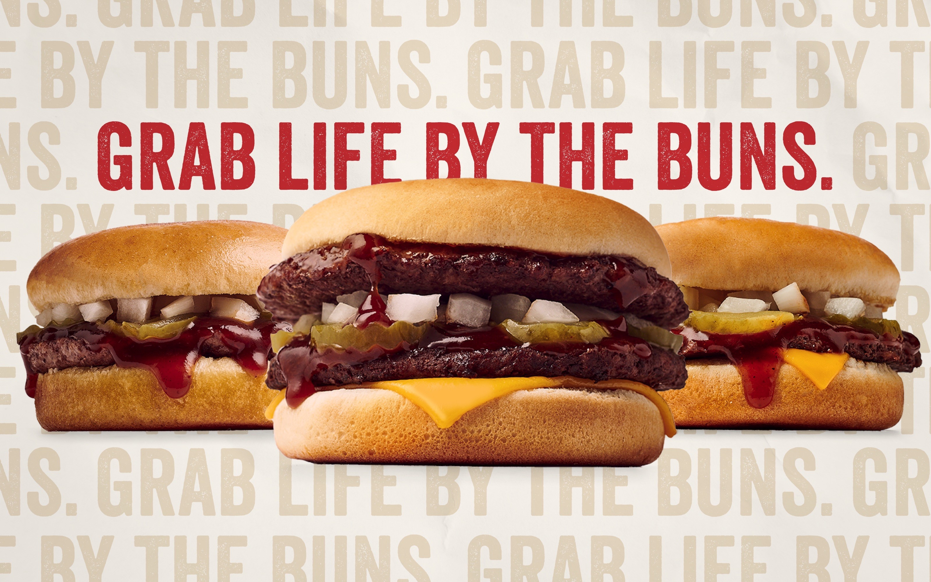
A cheeky website redesign built around appetite, speed, personality, and the unmistakable voice of Milo’s.
Client
Milo's Hamburgers
Services
Web
Agency
Cayenne Creative
Year
2024
About the Project
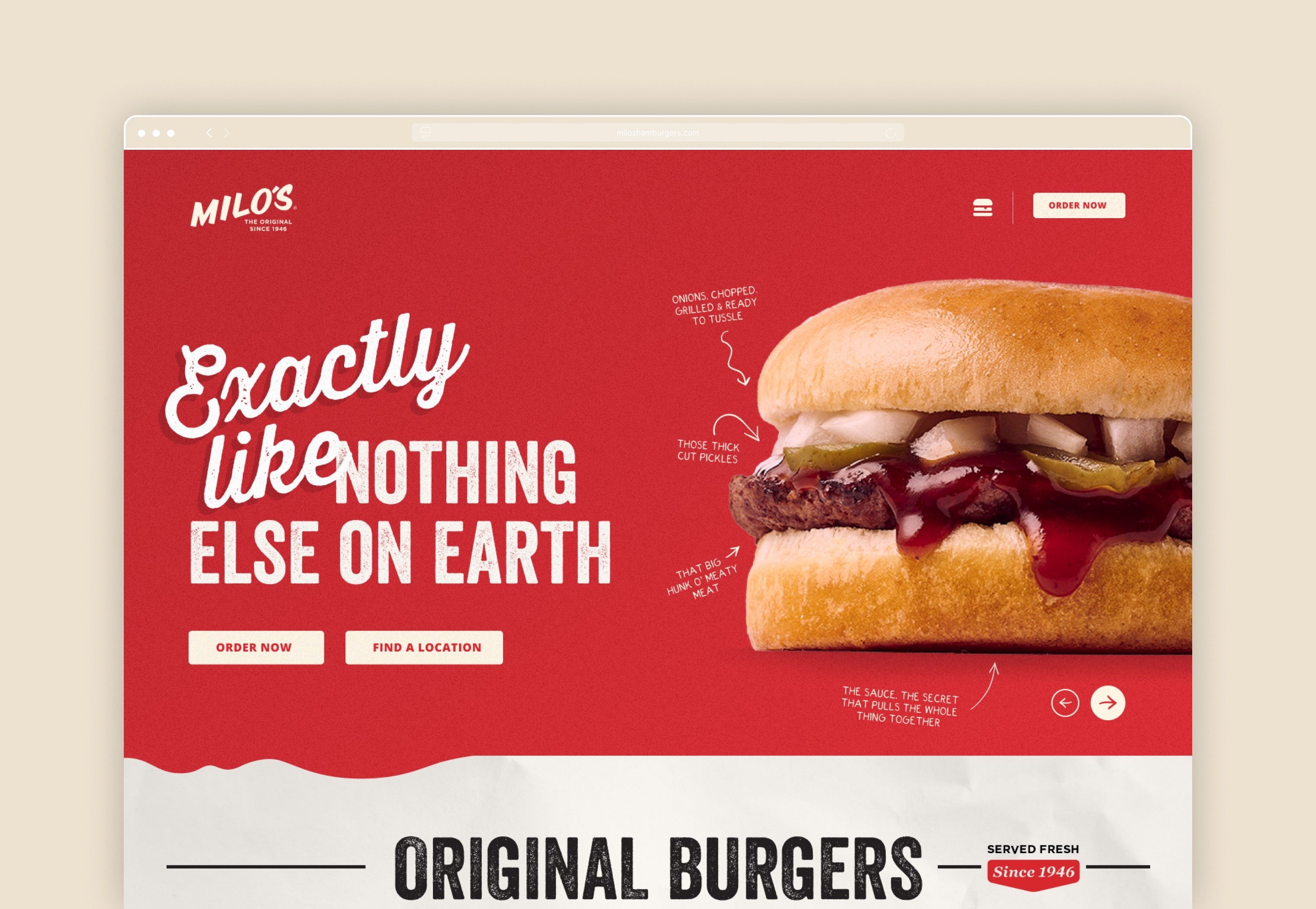
The site turns the Milo’s experience into a bold, product-forward digital system built for craving, ordering, and brand recognition.
The Milo’s website was designed to feel energetic and easy to use. Large food photography, bold headlines, and direct calls-to-action bring the menu forward from the first interaction. The experience keeps ordering and location-finding close at hand, while giving the brand’s personality room to show through short, memorable phrases and playful product moments.
The Approach
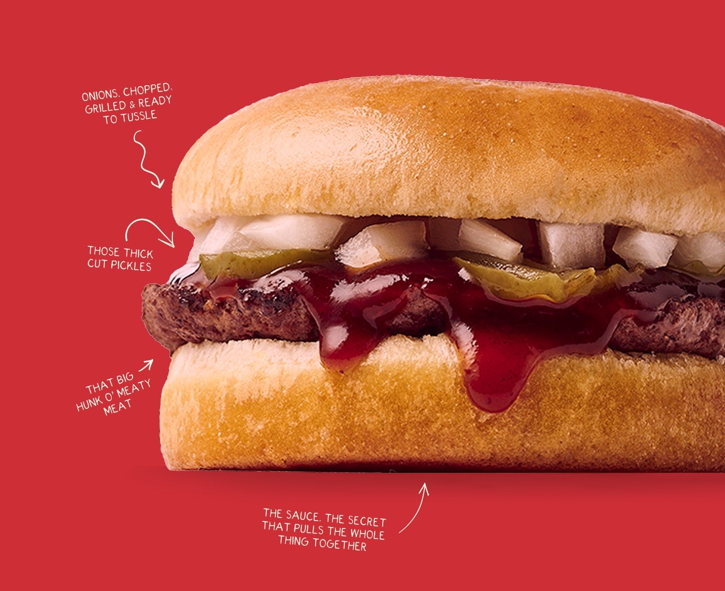
The direction focused on appetite appeal, fast navigation, and brand voice. Product photography, bold type, and simple user paths were used to connect cravings with action as quickly as possible.
A website that makes the brand feel as memorable as the food itself.
The final site gives Milo’s a digital presence with the same energy people associate with the restaurant. It's functional without feeling generic, playful without getting in the way, and built around the simple truth that visitors usually arrive hungry. The design brings together menu exploration, online ordering, locations, loyalty, and brand storytelling in a way that feels natural to the experience. Every interaction supports the larger goal: make the food easy to want, easy to find, and easy to order.