
SERVICES:
BRANDING
Role:
Creative Director / Designer
Sauza Pizzaria
A Slice Of New York
The brand needed to feel lived-in from the start. The challenge was not simply to look appetizing, but to create a visual world that felt social and already in motion. The identity had to carry the looseness of a night out while still being disciplined enough to hold up within a complete brand system.


Approach

The identity was shaped around the idea of spontaneity. Rather than idealizing a night where everything goes as planned, the Sauza brand embraces the unexpected delights of grabbing a slice with a friend on a busy night out. For this to click, the logo needed to feel unforced, and connected to the kind of nights that turn a simple meal into a memory.
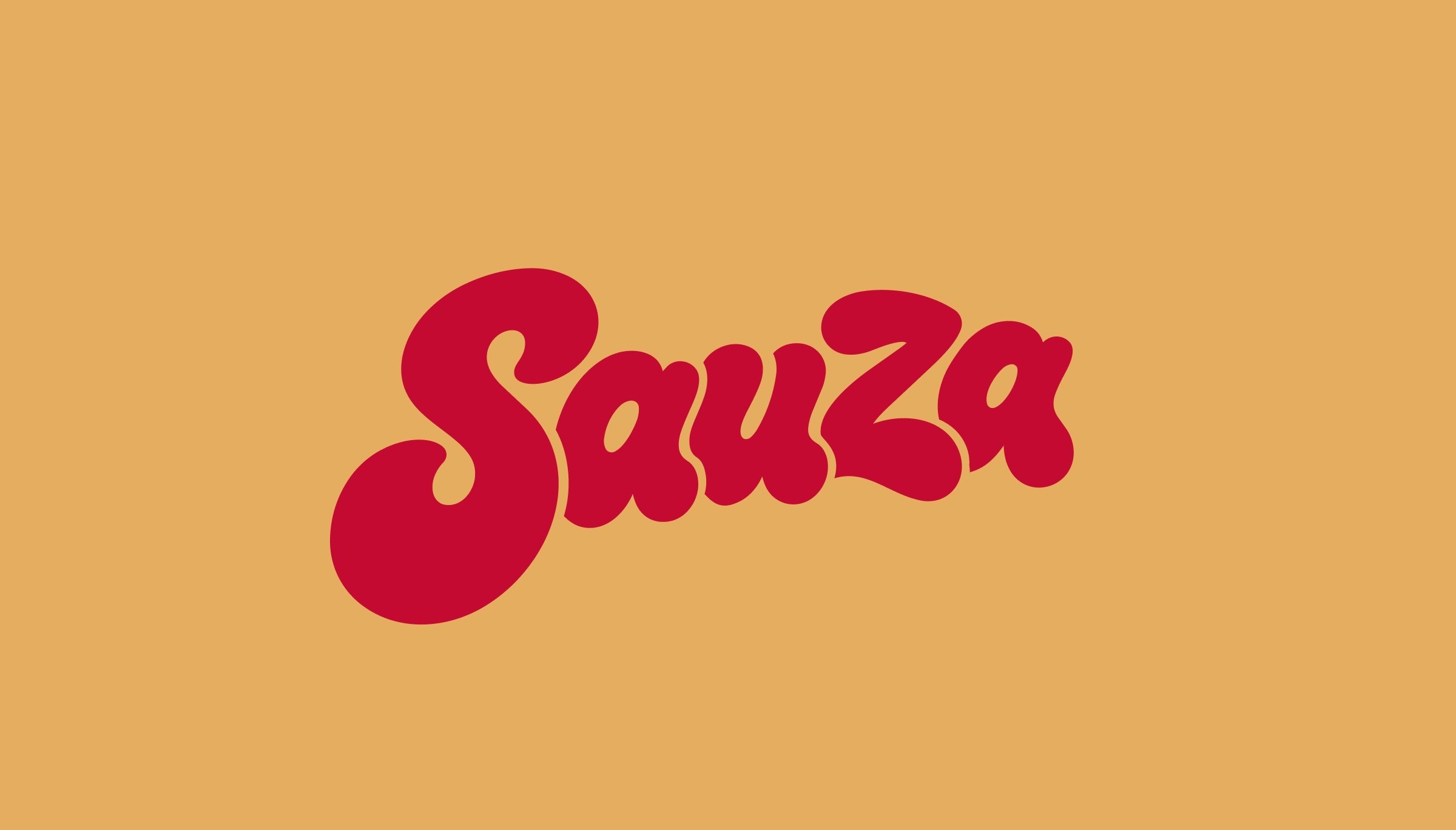
Early logo exploration focused on finding a wordmark with movement and the confidence to carry the brand on its own.

Process
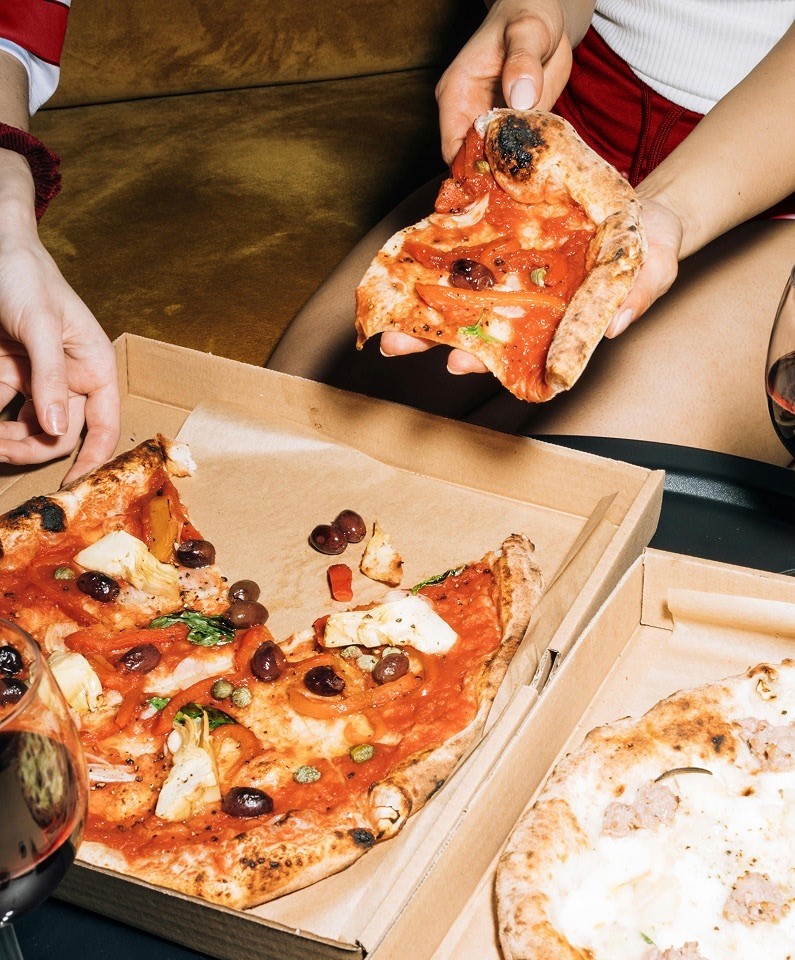
The visual direction grew from the atmosphere around the table, where flash photos, red sauce, and shared slices create their own kind of energy.
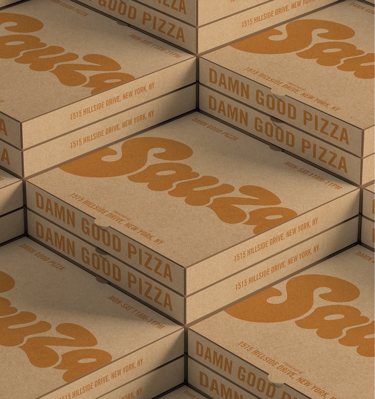
The process began with studies in composition and letterform, searching for a mark that felt bold without becoming rigid. From there, the system was built to support the wordmark with color, type, image direction, and brand applications that feel natural to the world memories that Sauza wants to create.

Design
Its strength in design comes from balancing appetite with attitude and giving the brand enough personality to feel distinct while still feeling natural in the everyday rhythm of a New York.
The result is an identity that feels casual on the surface, but considered in every detail.